Neutral Colors and Textures: Creating Harmony in Minimalist Spaces through Visual Optimization
Exploring the Essence of Neutrality in Design
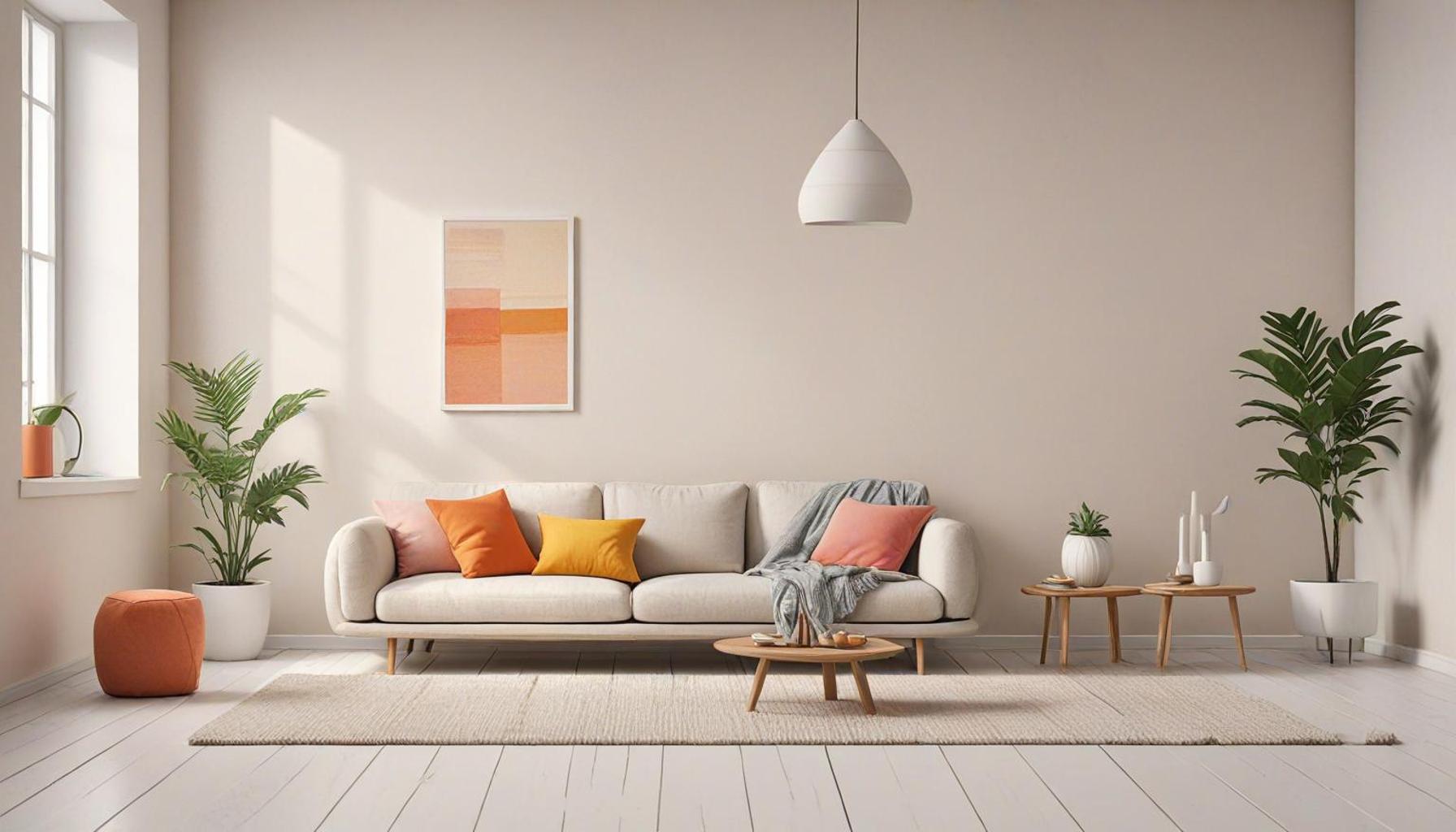
Neutral colors and textures play a pivotal role in crafting minimalist spaces that evoke a sense of calm and balance. As modern interior design evolves, the emphasis on visual optimization through subtle hues is becoming increasingly pronounced. Understanding how to effectively incorporate these elements can transform ordinary living spaces into serene retreats that encourage both relaxation and productivity.
- Common Neutral Colors: Grays, beiges, whites, and taupes
- Textural Elements: Wood, stone, fabrics, and metals
- Key Benefits: Flexibility, creating depth, and enhancing natural light
Incorporating these neutral colors allows for an expansive feel, which is essential in minimalist design philosophy. For instance, a soft gray wall paired with a rustic wood accent creates a warm and inviting atmosphere, while keeping the space uncluttered. When combined with various textures, such as plush linen throw pillows or a sleek marble coffee table, these tones create layers that add visual interest while maintaining simplicity. The interplay of each element is crucial; for example, a taupe sofa can act as a grounding element against a backdrop of crisp white walls, facilitating an ambiance of relaxation and focus.
The Allure of Minimalism
Minimalism extends beyond merely reducing clutter; it aims to enhance life through intentional simplicity. The strategic use of neutral colors and rich textures opens doors to numerous design opportunities while ensuring a cohesive aesthetic. When you walk into a room where soft beiges harmonize with natural wood and carefully chosen metallic accents, the effect is not just visually striking but also emotionally uplifting.
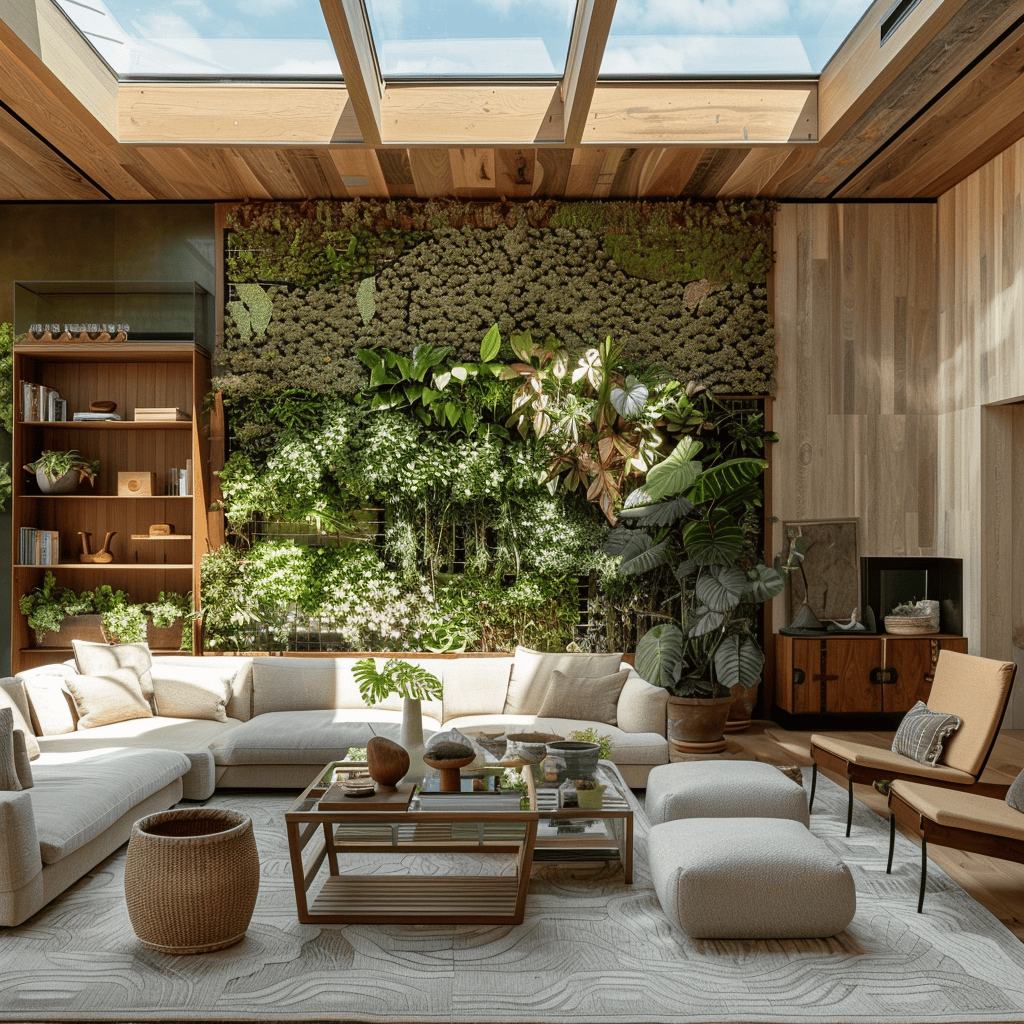
One exemplary approach is incorporating plants into a neutral palette. Green foliage against earthy tones brings a touch of life into the space, fostering not only a connection with nature but also an inviting, fresh atmosphere. The inclusion of natural elements, such as large stone sculptures or wooden vases, can break up the monotony of a color scheme while still aligning with the principle of minimalism.
As we delve deeper into the world of neutral colors and textures, it becomes clear how these choices lead to innovative solutions for creating harmonious, minimalist spaces. Whether in urban lofts or suburban homes, embracing these design principles can ultimately cultivate environments that foster tranquility and encourage peaceful living.
DIVE DEEPER: Click here to uncover more strategies
Exploring the Psychological Influence of Neutral Colors and Textures in Design
The interplay between neutral colors and textures in minimalist design transcends mere aesthetics; it profoundly affects our psychological state. Understanding how colors influence emotions can significantly enrich our living environments. Numerous studies indicate that colors possess the power to invoke specific emotional responses. In minimalist settings, the thoughtful selection of soft and muted tones paves the way for a serene ambiance. For example, warm beiges and soft grays are often associated with comfort and stability. These colors do more than please the eye; they create an environment that nurtures relaxation and introspection, turning a house into a sanctuary for the mind.
The subtlety of neutral colors serves as a canvas, while the incorporation of various textures adds the depth essential to minimalist design. Imagine stepping into a calm space with a gentle palette of whites and beiges, paired with tactile elements such as a rough stone coffee table or soft cashmere cushions. This combination not only captures visual interest but also enriches the sensory experience, dispelling the notion that minimalist design must be stark or unwelcoming.
Emphasizing Visual Harmony Through Textures
Creating visual balance in minimalist spaces involves the strategic layering of textures to prevent monotony. Here are a few effective strategies for this:
- Layered Fabrics: Incorporate elements such as plush rugs, linen drapes, and wool throws. These not only provide warmth but also introduce comfort and coziness into a space.
- Natural Elements: Use wood furnishings, stone decorations, or even indoor plants to offer organic contrast and lively textures that can counterbalance smoother surfaces.
- Metals: Introduce accents made from brass or stainless steel to infuse a touch of modern elegance. This addition creates a striking contrast against the softer textures in the room.
By thoughtfully integrating these elements, a cohesive and inviting look materializes, embodying the minimalist philosophy. For instance, envision a beige linen sofa adorned with textured throw pillows in varying shades of cream and taupe. This arrangement not only achieves a visually stunning effect but also invites comfort. Such design choices inspire individuals to fully engage with the space, providing both ease and a reflection of sophisticated simplicity.
As we delve deeper into the relationship between neutral colors and textures, it becomes increasingly clear that their true essence lies not solely in aesthetic appeal but in fostering living spaces that promote serenity and practicality. The art of blending diverse textures within a neutral palette fosters a comprehensive design approach that transforms homes into personal oases. These spaces enable residents to unwind and rejuvenate, offering solace amidst the often chaotic rhythm of modern life.
In essence, embracing color psychology and texture in minimalist design can lead to elevated well-being. It encourages an introspective lifestyle that recognizes the benefits of a thoughtful and harmonious living environment filled with both beauty and functionality.
| Advantages | Characteristics |
|---|---|
| Enhanced Visual Appeal | Utilization of neutral tones creates a soothing ambiance. |
| Increased Space Perception | Light and airy color palettes visually enlarge minimalist areas. |
| Versatility in Design | Neutral colors provide a flexible backdrop for various styles. |
| Timeless Appeal | Creates a classic, unchanging aesthetic that’s always in vogue. |
Incorporating neutral colors and various textures significantly enhances the overall atmosphere of minimalist spaces. These elements work harmoniously to evoke feelings of calmness and tranquility, making any space feel more inviting and organized. Furthermore, the integration of diverse textures—such as soft fabrics, wood grains, and natural stone—adds depth without overwhelming the senses, reinforcing the appeal of minimalist design. In creating harmony with these visual strategies, homeowners can achieve a sense of balance and sophistication. The subtle interplay between light and dark neutral shades allows for a seamless transition between different areas, drawing the eye naturally through the space. This visual optimization not only maximizes comfort but also becomes a statement of personal style that speaks volumes without uttering a word. The end result is a refreshing environment conducive to productivity, relaxation, and creativity—attributes essential in today’s fast-paced lifestyle.
DIVE DEEPER: Click here for practical strategies
Utilizing Neutral Colors to Enhance Spatial Perception
In the realm of minimalist design, neutral colors do more than simply beautify a space; they also manipulate spatial perception in remarkable ways. When used appropriately, these tones can create an illusion of expansiveness, fostering a feeling of openness that is essential in contemporary living spaces. For instance, light shades of gray, white, and beige reflect light rather than absorb it, effectively amplifying the available natural sunlight. This kind of emphasis not only enhances the visual appeal but also boosts the overall mood of the room, making it feel more inviting and airy.
Moreover, the concept of visual optimization can be explored further with the strategic placement of neutral colors. According to a report by the American Society of Interior Designers (ASID), rooms painted in lighter shades are perceived to be about 15% larger than those adorned in darker colors. This property makes neutral colors an essential consideration, especially for small apartments or rooms where maximizing space is key. By selecting a color palette anchored in soft neutrals, designers can indeed manipulate the dimensions of a room, making it feel less cramped and more inhabitable.
Creating Contrast for Visual Interest in Minimalist Spaces
While the essence of minimalist design lies in simplicity, achieving balance requires a careful play of light and dark elements. Contrast can be introduced in minimalist settings by mixing various hues of neutral colors alongside thoughtful textures. The inclusion of a glossy black accent chair or an charcoal gray artwork against a backdrop of muted whites not only grounds a space but adds dimension and intrigue. This method ensures that while the room maintains a harmonious look, it does not become visually drab or monotonous.
In practical terms, consider using an accent wall painted in a deeper neutral shade, like slate gray, to draw focus without overwhelming other elements; this technique has gained traction as a design trend. Pairing this with textured elements such as rustic wood beams or a woven wall hanging can create visual depth and elevate the aesthetic appeal of minimalism.
Another effective strategy for achieving contrast is through layered lighting. The right lighting can dramatically enhance the texture of a space, bringing out subtleties in fabric and surface finishes. For example, strategically placed recessed lighting can highlight a textured woven basket or a brick wall while casting gentle shadows that add warmth and coziness. This creates a dynamic environment that feels both vibrant and peaceful, exemplifying the harmony fundamental to minimalist design.
Furthermore, accessorizing with curated decorative pieces plays a significant role in reinforcing a cohesive aesthetic. Consider accentuating a neutral color scheme with select items that introduce variations in texture—such as a ceramic vase against a streamlined wooden table or a glass sculpture amid fabric upholstery. These curated arrangements allow the space to maintain an uncluttered yet thoughtfully personalized feel that resonates with minimalist principles.
In essence, neutral colors combined with varied textures in minimalist spaces not only foster a sense of calm but also elevate the tactile and visual engagement of a room. Understanding how to balance these elements effectively can lead to profound transformations in living environments, marrying beauty with functionality in an artful manner.
DISCOVER MORE: Click here for practical tips
Conclusion: Embracing Harmony in Minimalist Design
In the pursuit of minimalist design, the marriage of neutral colors and various textures emerges as a powerful tool to create visually optimized environments. Through the strategic use of lighter shades, one can successfully enhance spatial perception, making areas appear more expansive and inviting. As established by the findings of the American Society of Interior Designers (ASID), light neutral palettes significantly contribute to feelings of openness, making them an ideal choice for compact living spaces often common in urban settings.
However, minimalism is not synonymous with uniformity. The thoughtful interplay of contrasting tones and textures fosters a dynamic aesthetic that keeps the eye engaged. The use of accent walls, layered lighting, and curated decorative pieces elevates the overall design, allowing for a personalized yet uncluttered ambiance. These elements together form an intricate dance of simplicity and sophistication that captures the essence of modern living.
Moreover, as we navigate the trends of contemporary interiors, understanding the role of texture in adding depth becomes increasingly essential. Whether it is through the warmth of natural materials or the sleekness of smooth surfaces, textures play a crucial role in enhancing the tactile quality of a space. Thus, embracing neutral colors paired with varied textures is not merely about decoration; it is about cultivating an atmosphere that promotes tranquility and promotes a harmonious living experience.
As you contemplate your own living spaces, consider how you might utilize these design principles. Let neutral tones guide your palette while textures enrich your environment, leading to a home that is not only aesthetically pleasing but also profoundly functional and emotionally resonant.
Related posts:
The Impact of Technology: Space Optimization Tools for a Minimalist Lifestyle
Minimalism in the Kitchen: Space Optimization Strategies to Simplify Daily Life
Creating Calm Sanctuaries: Space Optimization Techniques in Minimalist Rooms
The Art of Unpacking: How to Organize Workspaces with Minimalism
Spaces that Inspire: Space Optimization Strategies in Leisure and Entertainment Environments
Integrating Nature and Minimalism: Space Optimization Strategies with Plants in Indoor Environments

Linda Carter is a writer and organization expert specializing in minimalism and personal organization. With extensive experience helping individuals create clutter-free, functional spaces and adopt mindful habits, Linda shares her knowledge on our platform. Her goal is to empower readers with practical advice and strategies to simplify their lives, stay organized, and achieve a sense of calm and balance in their daily routines.